Posted: May 16, 2023
For indie authors, publishing a book is expensive. First comes the challenge of writing the book, but then, if you want it to be successful, you must invest in it. You pay for editing, cover design, marketing—all of which drain your wallet. It’s understandable to want to save a bit here and there, but the danger in that is cutting corners.
The interior design of a book seems like a small thing that you can handle yourself. After all, you have the tools to do so, you know the theory, and there are millions of books out there to look to for inspiration. It can’t be that hard, right?
Unfortunately not. It’s worse for me because I’m trained to spot these mistakes, but there have been many books that I’ve refused to buy because of poor design—even if I’m interested in the story. With that in mind, here are ten errors that authors incorporate into their books when trying to design it themselves.
Microsoft Word is a staple in most authors’ repertoire. All authors have a word processing programme of some kind, and Word is the most common. It can be used for page design. You can change the size of the page, the margins, the text, even add some other formatting, but it is still just a word processing programme. It is not designed with book formatting in mind. It’s like using a screwdriver to hammer in a nail: It’ll get the job done, but that’s not what it’s meant for, and things are more likely to go or be done wrong in the process.
Currently, the professional standard software to use in book design is Adobe InDesign, which works on a subscription basis and is too expensive for an author to justify paying for to design one—or even five—books.
Paper is next. Amazon (the main company self-published authors use) offers plain white paper, crème paper, and even premium paper for full colour printing. You can select any one of these for your book, but the importance is the distinction in use and function. It says right on the website, but here, again, I’ll share that fiction books are meant to be printed on crème paper. Staring at stark white is hard on the eyes, but it’s used for textbooks and others (like cookbooks) because it makes for higher quality images. Novels typically do not have images or have them in black and white. Save your readers’ eyes; print on crème.
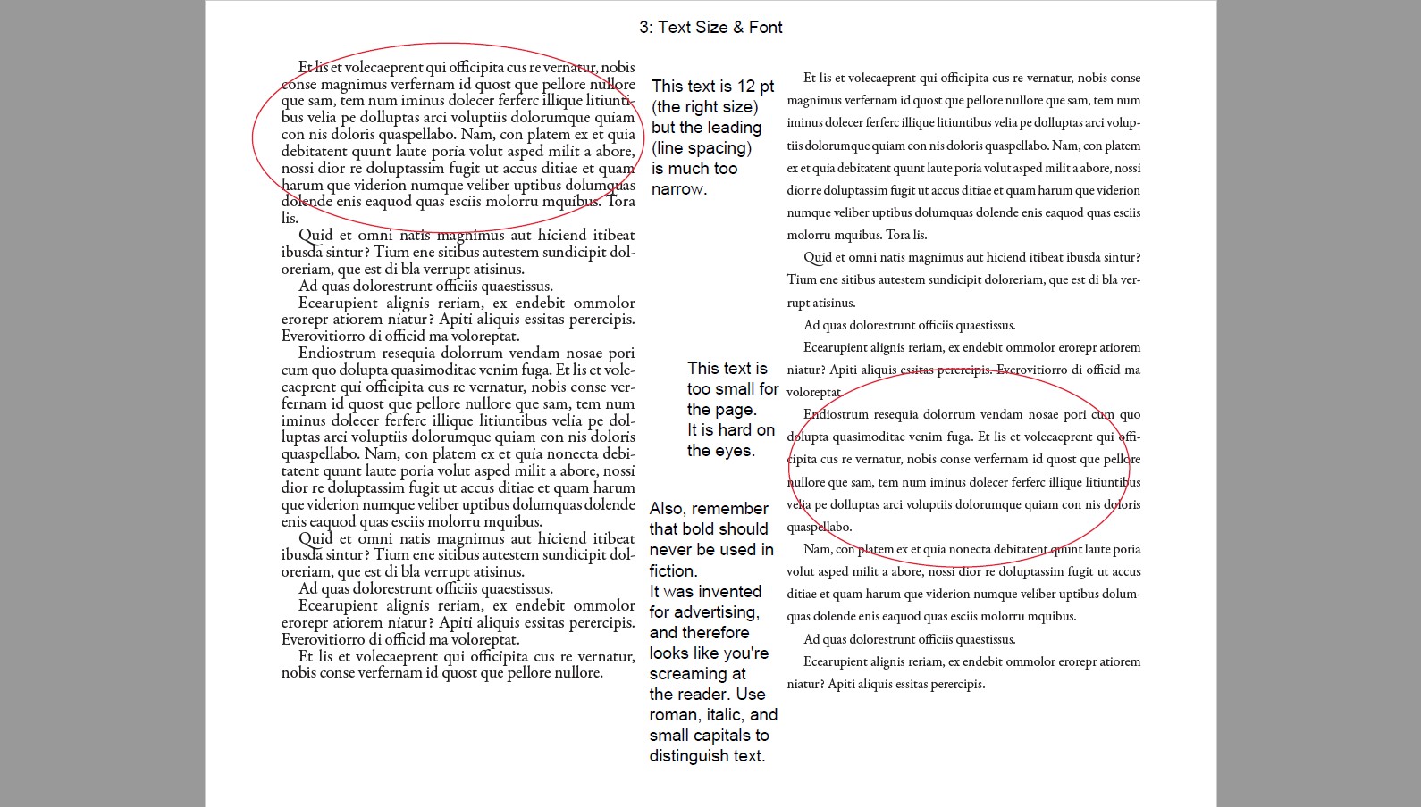
Text size is another important thing because it must match the book you’re writing. You may know that children’s books have much larger text. Teen, Young Adult, and Mature books have smaller. The standard is 11 or 12 pt (“point”—unit of measurement) text in Times New Roman, while Children’s books are typically 16 pt. Typographically, there is a formula for choosing the correct size of text to match your book’s page and margins—30-45 lines per page and 60-66 characters per line. These vary by genre and age range, but scientifically, it’s the sweet spot you must hit before your eyes lose their place on the page.
Fonts are another thing. You want your body text to be readable and enjoyable to read. You may even want to avoid using Times New Roman or any other common font because they’re just that—common. That’s fine, but you should be careful not to go with something crazy. Always go with a well-made font for your body text. These typically include 8 styles or more (roman/regular, italic, bold, etc.), and while you may not need all of these styles, it shows you that the font is well-researched and professionally made.
Title fonts are where you can get a bit more creative. However, the title font must be carefully chosen to suit your book’s genre, theme, and tone, all the while being readable and—more importantly—pleasing to the eye. Separating fonts by genre is usually easy, but differentiating between genres is sometimes hard; how do you tell the difference between a Space Western font, a Space Opera font, a Military Scifi font, and a Fantasy Scifi font?
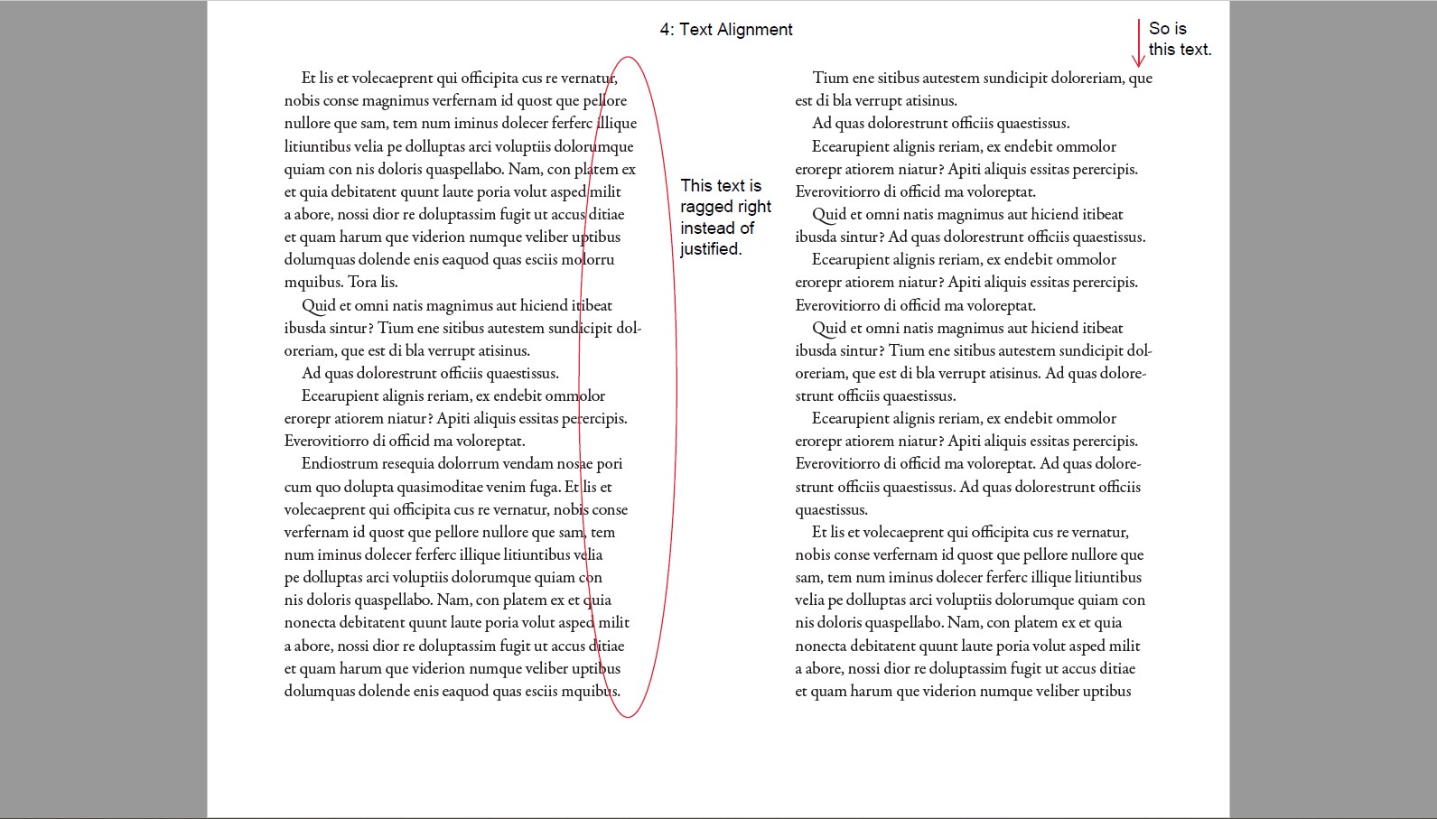
Never—NEVER—set your entire novel in Ragged Right. (Ragged Right means text that is aligned straight along the left edge but leaves a ragged line along the right edge because of word length and sentence structure. Open any fiction book right now and you’ll see that it does not do this. Both sides of the text are straight, and this is because the text is Justified, meaning the spacing between the words of each line has been minutely adjusted so the text goes to the very end.
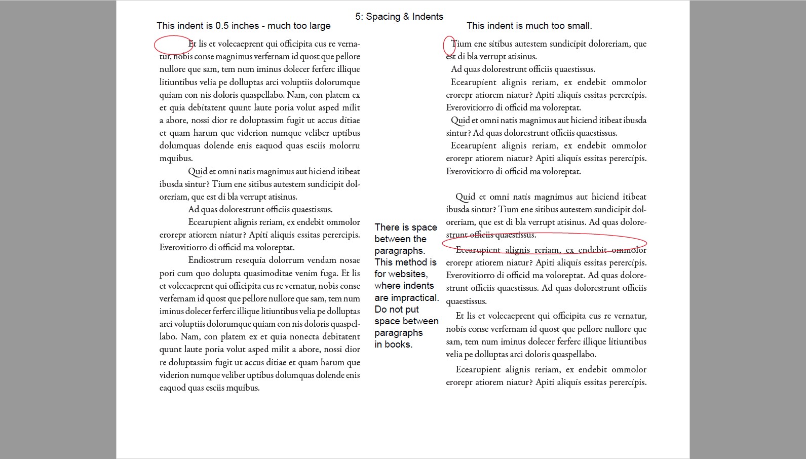
I’ve seen so many books that add an indent to the first paragraph. I’ve also seen so many books with too big or too small of an indent, and it’s frustrating. The reason we use indents is to mark the start of a new paragraph. Initially, a pilcrow (paragraph mark) was manually added to the beginning of each paragraph, but lots of people were too cheap to get that done, so the space remained blank; thus, the indent. The reason it isn’t needed at the beginning of the first paragraph in a chapter or after a break is because it’s obvious that it’s a new paragraph. The space is already there; those paragraphs should be Flush Left (in line with the left edge of text).
As for indent spacing… The space should be one em-space, meaning the width of a capital letter M in the size of the font you’re using. An easy way to know this number is simply to look at the size of the type you’re using, because the letter M is traditionally a perfect square. If you’re using 12 pt text, the indent should also be 12 pt (or 1 pica). If you’re using 11 pt text, the indent is 11 pt, and so on.
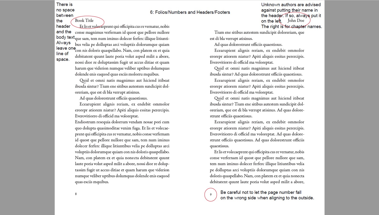
Most people just call them page numbers, but the official term for the little number at the top or bottom of your book’s page is folio, and getting these correct can be difficult if you’re not using the right software. It’s especially difficult when you want to add text as well (such as your name, the book’s title, or the chapter titles).
You’ve probably seen books with different combinations of information, usually at the top of the page. The author’s name or book title on the left, chapter title on the right. A lot of people will put their name at the top of the page, but in reality, the main point of headers is for navigation. It’s to remind the reader what chapter their reading, first and foremost. Secondly, to remind them which book their reading. Often, famous or bestselling authors get their name put there instead because its better for business to remind readers who they’re reading, but self-published authors typically aren’t well-known enough for their name to be used in this manner. Still, if your chapters are merely labelled Chapter 1, Chapter 2, and so on, you can include your name on one side (always the left), then the book title on the other.
Also ensure that the first page of your book’s main text (the story) falls on Page 1, meaning you must make changes to the Numbering Options of your book, so that it’s not page 7 or something.
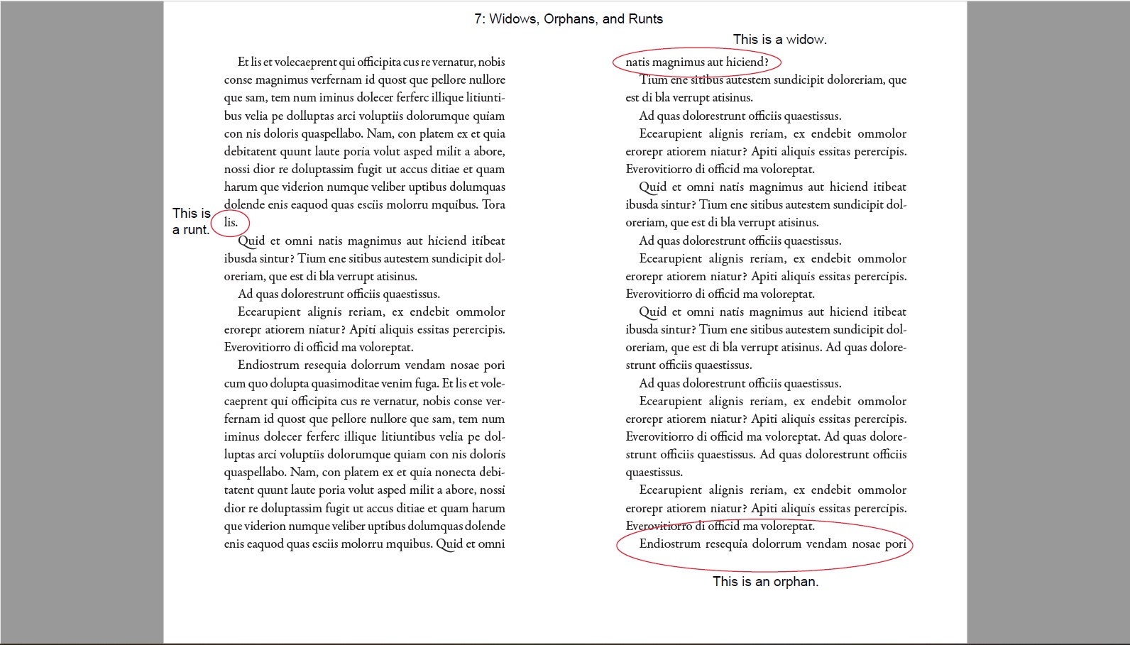
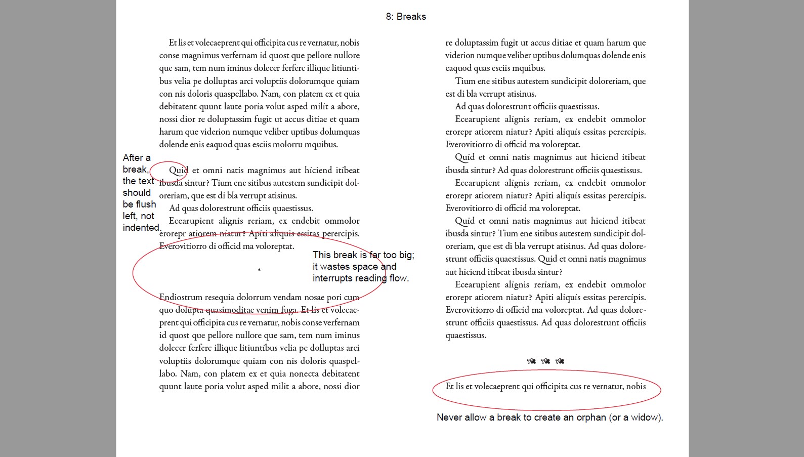
This is more of a typesetting thing, and even traditionally published books get this wrong sometimes. Have you ever opened a book and the first or last line of a paragraph is on a different page from the rest of it? Or a single word has been pushed to the next line all by its lonesome? That’s what these are. Widows are when the last line of the paragraph appears at the top of the next page. Orphans are when the first line of the paragraph appears at the bottom of the page whereas the rest of the text goes onto the next page. Runts are the single words that get a line to themselves. There are ways to automate the removal of these errors, but mainly, the typesetter must go through the book page-by-page to adjust spacing and alignment so widows, orphans, and runts do not appear.
I’ve seen so many books in which the breaks are far too big. They don’t need to take up three lines of space. Breaks within the page (not at the top or bottom) don’t need to have a symbol to show you that there’s a break there (though it’s not incorrect). All breaks do is show the reader that the book is abruptly changing scenes, and breaks that take up two or more lines in the text is simply wasting space.
I’ve included this only because I once purchased a book that was so entirely lacking in correct methodology that it pains me. These pages are always represented in lowercase roman numerals. In order, the pages you should include in a novel are thus:
Then, you have your book. This should always start on Page 1 (numbering options must be changed for this to happen). If your book is split into parts, have Part 1 on this page, starting on page 1, so the Prologue or Chapter 1 begins on page 3.
After the book comes the endmatter. Most of this stuff is optional or used in textbooks, so I’ll only include the typical fiction novel (and added self-publishing) pages here:
On top of all these technical aspects of the book’s formatting that most authors don’t understand, there is another fact to consider: It is called Interior Book Design. Just like how your book’s cover should reflect the genre, themes, and tone of your book, so too should the inside. For those not well-versed in professional book design, this is difficult, and while you may not think it’s important, readers will notice the difference between a poorly designed book and a professionally designed one.
Most obviously: Styles.
A Fantasy book should have a completely different design than a Science Fiction book, which in turn won’t look the same as a Historical Fiction book set in the Victorian era, and so forth. Going to a professional is even more important if you add specialized designs like newsletters, blog posts, or other elements that require special care.
From Pen to Published
Budgeting for Book Publication—Make a Plan
Navigating the World of Self-Publishing
Free Promo—Strategies to Promote Your Book
Tigerpetal Press is a small book press dedicated to publishing local authors and poets.